One of the neat things about GNOME Shell is that it’s pretty tweakable - to some degree - to customise it to a user’s preferences. I know some people use GNOME Shell stock experience. I don’t. I have previously written about some of my must-have extensions and add-ons. This supplements that with what I do to further tweak my (currently) Ubuntu 20.10 system to my liking.
Note: These are the settings I configure on my computer that I use all day every day. If you don’t like these settings, I frankly don’t care mind, you’re not using my PC. 😎
My main system setup is a desktop PC with two landscape 1080p displays, side-by-side, with an IBM Model M keyboard and bluetooth mouse. But on laptops, I configure everything the same as this, in case I use an external monitor and mouse (which I often do).
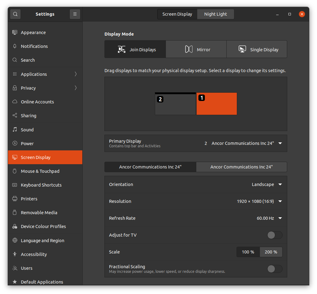
Here’s what the desktop looks like:
Theme
I love the work the Yaru team have done on the default Ubuntu theme. I personally prefer the Yaru-dark variant.
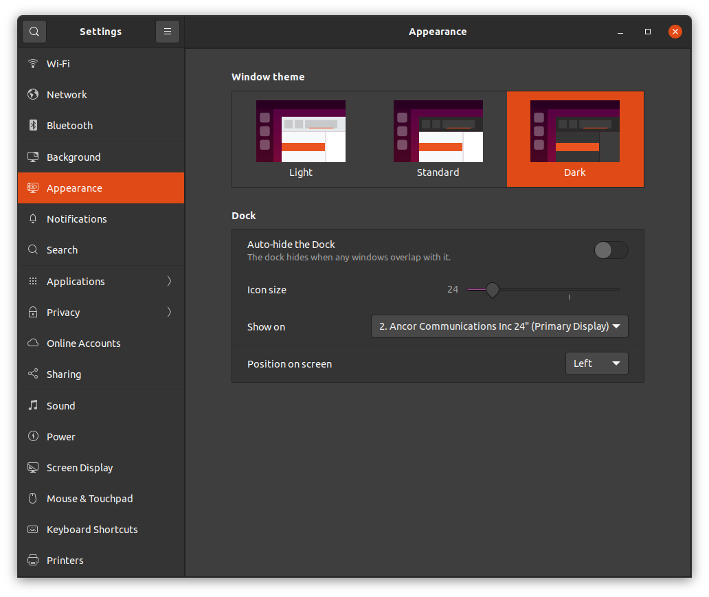
I also shrink the dock down to 24 pixels and keep it on the left-hand monitor. I tend to pin a bunch of applications in there which I use frequently.
User Theme
Weirdly (for some political or technical reason I don’t fully understand) in Ubuntu we don’t ship User Themes by default. The result of this is the majority of the desktop is dark, but if you open the notification panel or any indicators in the top right, you get blinded by the light theme.
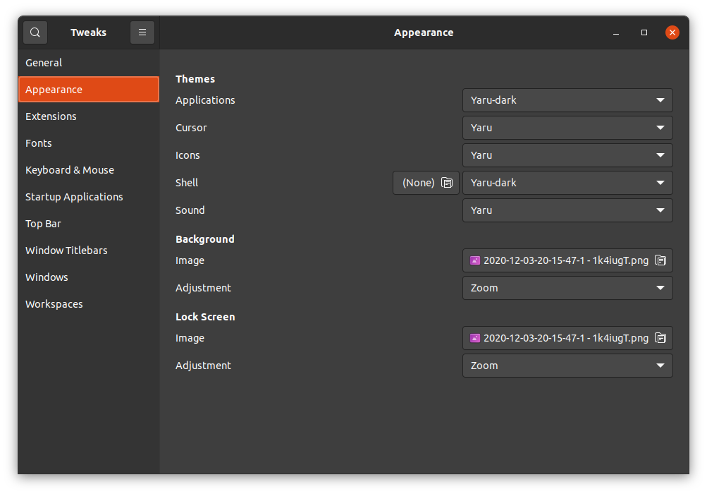
So I install the user themes extension and then visit GNOME Tweaks, Appearance section, to set the Shell theme to Yaru-dark. That’s better. We should ship this by default in my opinion.
Modal dialogs
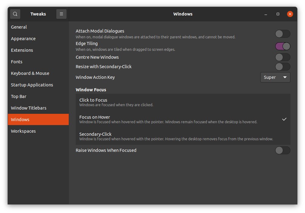
Having modal dialogs attached to the parent window is a frankly insane behaviour. Have a chat application open, choose to attach a file, a file dialog appears. Move the dialog out of the way of the chat window so you can refer back to the conversation and attach the correct file. The window moves with the dialog, even detatching it from the side of the monitor (if you’d snapped it there). Stupidly frustrating behaviour. Undo it in GNOME Tweak, Windows, Attach Modal Dialogues: Off.
Mouse behaviour
While we’re here in GNOME Tweak, Windows section, let’s “fix” the mouse behaviour. For many, many years I’ve enjoyed the focus follows mouse, sloppy focus, or focus on hover, whatever you want to call it. This ensures that I can type into whatever window is under the mouse cursor, even if something else is on top of it. I don’t click windows and bring them to the front, I just put my mouse where I want to type and start typing. Much better.
This makes more sense when you recall I tend to use ThinkPads with the glorious TouchPoint input device. That means even when using a mouse, my hands are on the keyboard. So moving my fingers a tiny bit to the nubbin, to nudge the mouse pointer over a window, type, then nudge it back, is a super efficient workflow without alt-tabbing, bringing entire windows to the front.
The only argument I’ve seen against this behaviour is “But Alan, what happens if you maximise every application to be full screen!? Then there’s no window to move your mouse to, surely”. To which I respond “One hyphenated word: Multi-monitor”
I seriously don’t think enough designers & developers consider the multi-monitor workflow, but that’s a rant for another day 😠
Screenshot Shadows
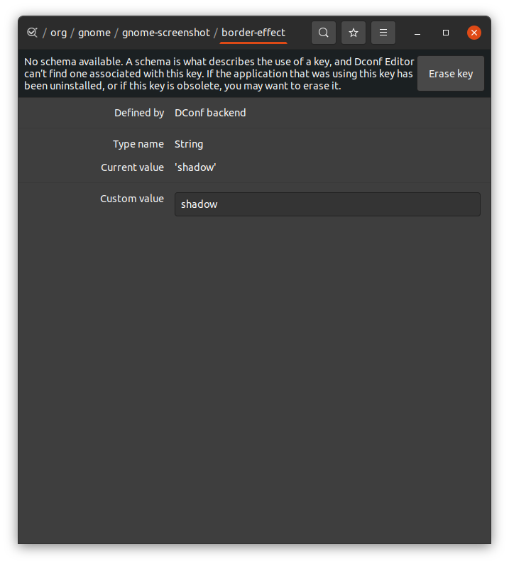
In an update to GNOME Screenshot a while back, the drop-shadow option was removed. Apparently this is something to do with Wayland. I don’t use Wayland, but I’m still on the X11 train. So, I re-enabled drop shadow with this dconf key edited with dconf-editor - /org/gnome/gnome/screenshot/border-effect. Just set it to shadow and you’re done.
Workspaces
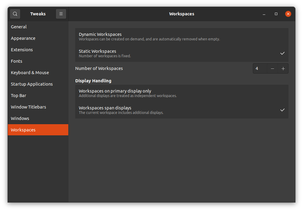
The default behaviour has only the current monitor move when you switch workspaces. I’m sure someone, somewhere enjoys this. I don’t. Having two monitors side-by-side and only one of them move when you switch workspaces while the other sits there like a dead badger at the side of the road is completely weird. See also, multi-monitor behaviour rant 👿
This is fixed in GNOME Tweaks, Workspaces, Display Handling.
Over the years I’ve used all manner of workspace layouts on Windows, MacOS and Linux. On MacOS, on Apple laptop hardware, having horizontal workspaces makes complete sense. Their gestures are way better than any other OS. Being able to switch workspaces quickly with a deft swipe of the hand on the trackpad is great. Also, being able to “peek” across one workspace to another, by half-sliding across the trackpad is just 😍 - I wish we had that. I might use trackpads then!
Narrator: He wouldn’t.
Alternatively, I quite like using a combination of keys to switch workspaces. In the past that was always Ctrl+Alt+⬆⬇⬅➡ where I’d have workspaces typically in a grid arrangement. I got used to having a mental model on Linux of what was on each of the four desktops.
With GNOME Shell having a fixed vertical-only arrangement of workspaces I felt cramped and found myself scrolling through workspace 2 and 3 to get to 4.

Time for another extension, Workspace Matrix.
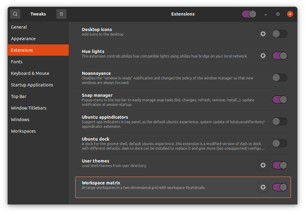
This gives me a grid of however many workspaces in either direction I desire. Today, I desire a 2 by 2 grid.
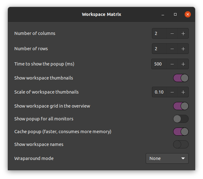
This means I can keep my 2x2 grid mental model, and flip directly from 1 to 4 with Ctrl+Alt+⬇➡ then back to 1 with Ctrl+Alt+⬆⬅. Other shortcuts may be available, but these are burned into my memory like this guy carries a blueprint around…

Conclusion
GNOME Shell is awesome. It gets better with every release. But the stock setup isn’t for me. So I can tweak it. This makes me a happy user.
