Why is this interface so alluring?
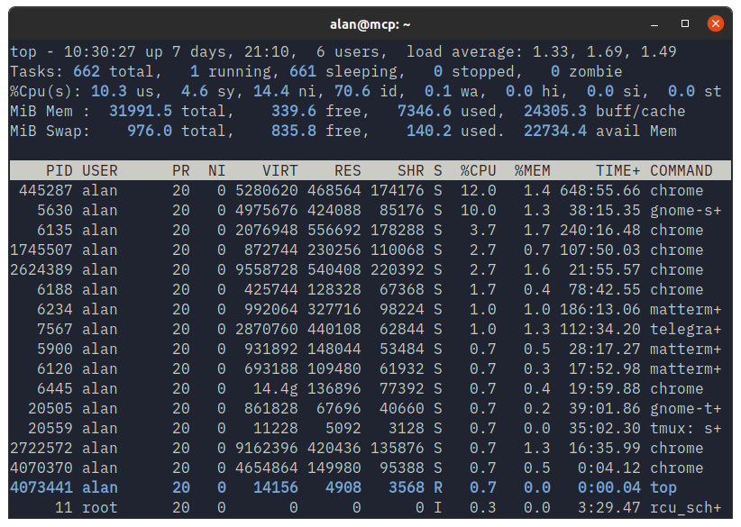
Okay, so that blank window might not be, let’s fill it with something more interesting. How about top.
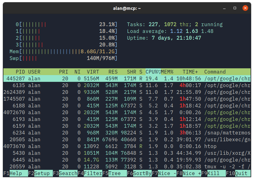
… or htop …
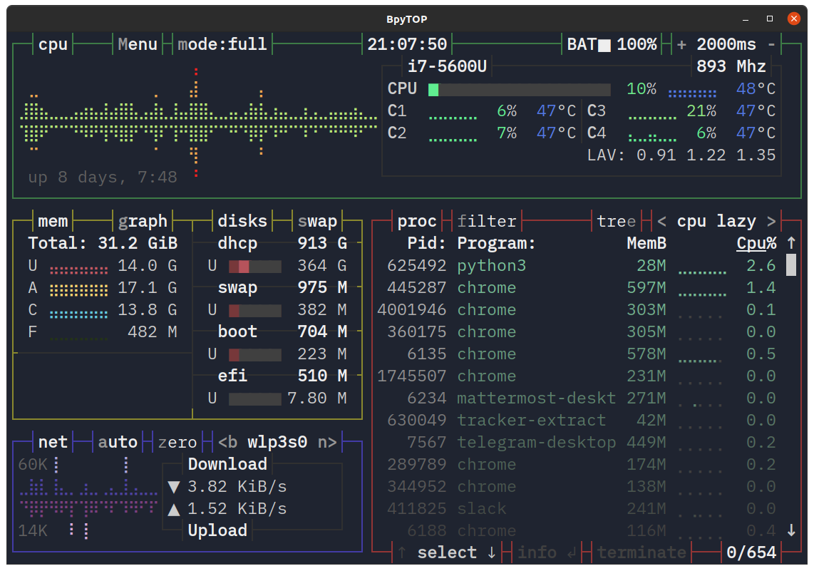
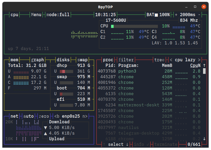
… or bpytop …
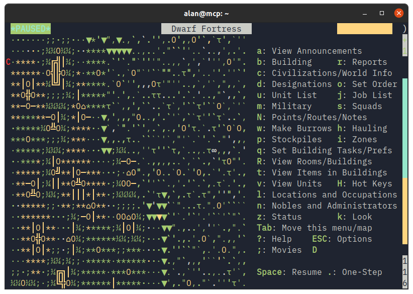
… or Dwarf Fortress?
Ignore for a moment it’s a GNOME Terminal window on Ubuntu with the Yaru theme, it’s the contents of the window that’s alluring to me. That and the IBM Plex font showing it off so well.
In around 1988, the first “IBM Compatible” I owned was an Epson 8086 PC with a Monochrome Display Adapter (MDA). It had a mono screen which could only output text, no graphics.
In 1990, I had to upgrade to a Hercules Graphics Card if I wanted to see anything other than text and symbols from code page 437.
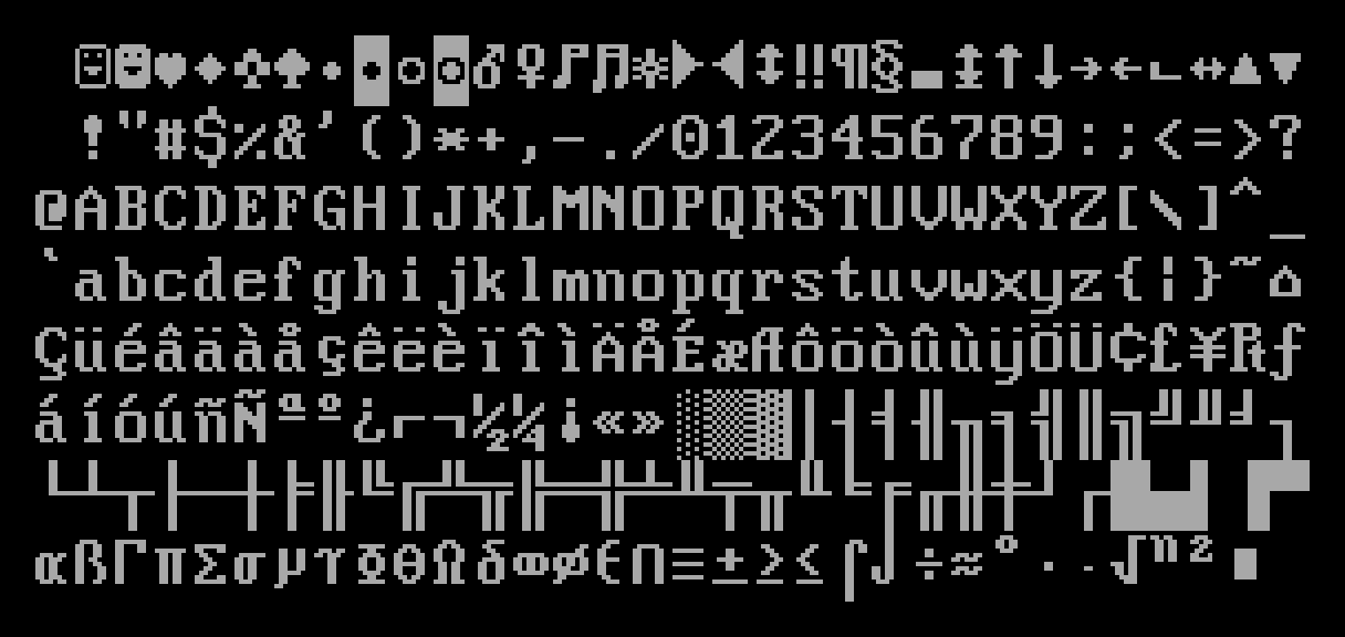
What magical worlds were created with only these scant characters and some imagination. Beautiful.
So for a couple of years on my PC I could only run and write monochrome text-based applications and games. Most of the software I used came on floppy disks I’d ordered via a catalog. Whenever the padded envelope would drop through the door I’d immediately start rummaging through the disks to see what it was I’d ordered, however many days before.
Instant gratification, it was not.
I taught myself Pascal at home and even dabbled in a little 8086 assembler, which I found both confusing and amazing after the Z80 code I’d played with on the ZX Spectrum and Amstrad CPC. Being restricted to text only output was quite limiting, but in a good way.
I could be surprisingly creative within the confines of an 80x25 text display. My mind was further blown when I found out MS-DOS supported higher resolution text displays with mode con lines=43 cols=132 🤯 I could fit so much more on my screen now!
The clear delineation of regions with a simple single-lined box was clean and purposeful. The rigid structure of a double-lined box even more so. Using the limited character set to make percentage bars, spinners and visual effects was simple and satisfying.
There were a few pre-defined characters we used in games back then. The “smiley” face and the inverse were stalwarts of the time. This was you.
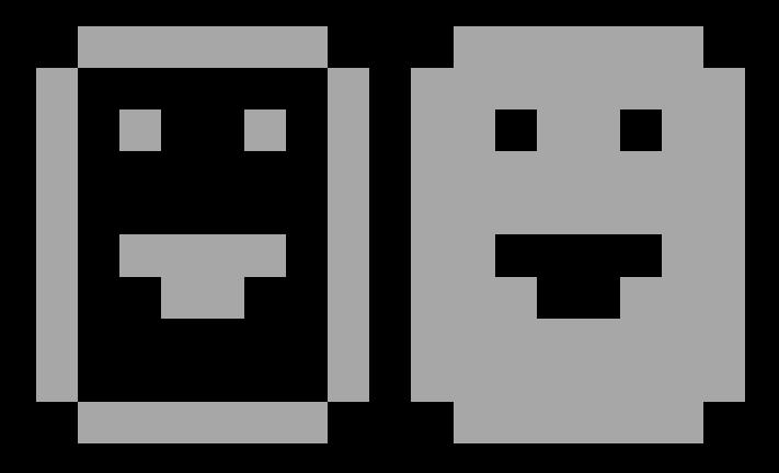
There was no pile of poo or yellow winking face, that came much later.
I guess having played with these characters so much during my early years on the PC, I grew to love them, and appreciate the creativity needed to get the most out of them. So while modern applications may well look pretty, I think I’ll always find these text-only applications more alluring, simply because they can do so much with seemingly so little.